
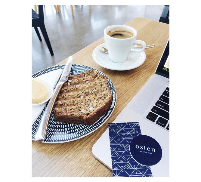
The brand I designed quite some years ago now for Osten cafe is possibly one of the earliest brands I created where the pattern associated with it became just as much an identity of the brand as the word mark itself.
These days as brands become less about being a “logo” and more about presenting an “idea” of themselves, I find myself working with colour and pattern often before the logo itself emerges. People seek meaning and an emotional connection to the businesses they choose to engage with, as well as an atmospheric aesthetic that they can experience and be immersed in.
With the Osten brand, the pattern is subtly applied to the entrance windows in transparent white, and more boldly visible on the interiors cushions and repeated on the menu cards. It’s all pulled together seamlessly and feels so complete.
Other examples of how this works brilliantly well is the Hamilton cafe Frank food and the iconic ice cream shop Duck Island - both brands identities envelope you the second you walk in the door. Whether you noticed the logo or not, it would have been impossible to have not ‘experienced’ the identity of those brands and that is truly powerful.